Today, I will show you how to add a dynamic chart in your WordPress pages. For this, we will use a WordPress plugin that connects with a SDMX source and generates interactive charts.
To generate nice charts, we use the powerful Highcharts JS library which provides a lot of different displays (bars, columns, lines, pies, …).
And data will be pulled out from our .stat Pacific Data Hub (PDH.stat) in the SDMX/JSON standard. This application is an instance of the .stat suite developed by SIS-CC and backed by OECD.
PDH.stat stores all statistical data coming from the Pacific Region. If you want to know more about this powerful tool, you can watch this video or consult the documentation:
WordPress plugin
A WordPress plugin developed maintained by SPC is available on the NSO WordPress instance. You could also download it from the gitlab repository, the latest release is available on this page.
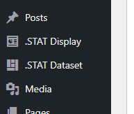
Make sure the plugin is activated, then you should see 2 new menus in the backoffice:
- .STAT Dataset to import datasets
- .STAT Display to create visualisations
You will be able to insert your .STAT Display into your pages/articles with shortcodes or using
Pick a dataset
The first step is to select the data you want to visualize. For this tutorial, let’s say we want to create a timeseries of the production of coffee in Papua New Guinea. We will use the “Crops and livestock products” dataset which gives a lot of information about the different type of crops in the Pacific. After setting up the filters correctly to select coffee for crop, production in tonnes for indicator and PNG for PICT we come up with this table. We can then open the Developer API panel:

We need here to get the API URL that give access to the data. From the Data query panel we click on Copy Code.
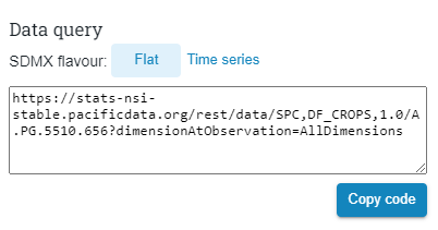
The URL is the following:
.Stat Dataset configuration
Go back to the WordPress administration GUI and click on .STAT Dataset to access the .STAT datasets administration, then click to “Add New”.
Add a title, let’s say “Coffe production in PNG”, and in the “PDH.STAT API Query URI” we paste the previously copied URL and we click on “Check query & Parse response”.
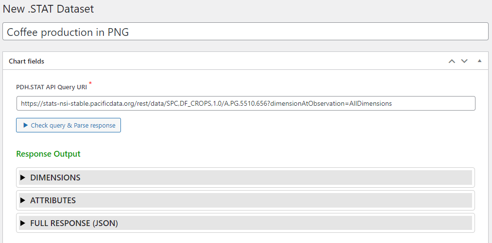
Analyze the API query result
The plugin will then make a request on the pasted URL adding “&format=jsondata” at the end to get the JSON version. It will parse the response to prepare the data for the visualisation and will cache it in the WordPress database. We can see some information extracted from the SDMX response in the expandable panels:
The Full Response (JSON) panel gives you access to the SDMX response this is usually used for debugging operations.
Set up parser configuration
We then need to fill up the “Parser configuration” panel. The parser will transform the JSON data to a simpler format to be used by our javascript library Highcharts. The configuration goes in a JSON format but needs every keys/values to be encapsulated by quotes.
There are different ways to transform the SDMX data for Highcharts depending on how many dimensions we need.
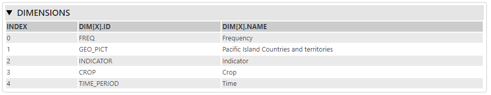
In this specific case, we want to display a 1-dimension timeseries chart with dates in x-axis and prices in y-axis. The series will be created on the crop Dimension #3 (as we only selected one crop – Coffee – we will get a single series). And the list of data values for this series will be indexed by time Dimension #4. We want also to extract the full date for future purpose so we add an extra field called “date” pointing to dim[4].name.
Here is the full configuration:
{
  "series": [ "dim[3]" ],
  "data": {
    "index": "dim[4].id",
    "date": "dim[4].name",
    "value": "value"
  }
}
Now we just need to click on
and publish the dataset.
Note that the dataset will be automatically updated every day with new data from .Stat (the Crop and livestock products dataset is updated every year).
.STAT Display
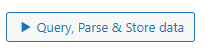
Now that we stored the dataset we will create the associated display. It is done under .STAT Display in the WordPress adminitration panel.
We need to select the .STAT Dataset we just created in 1.2, eventually add a title/subtitle or link to the source data and select a HighCharts configuration template it will be “Timeseries” here. Let’s keep it simple to start and leave the rest of the fields blank.
We need now to copy the shortcode delivered in the yellow section and click on “Publish”.
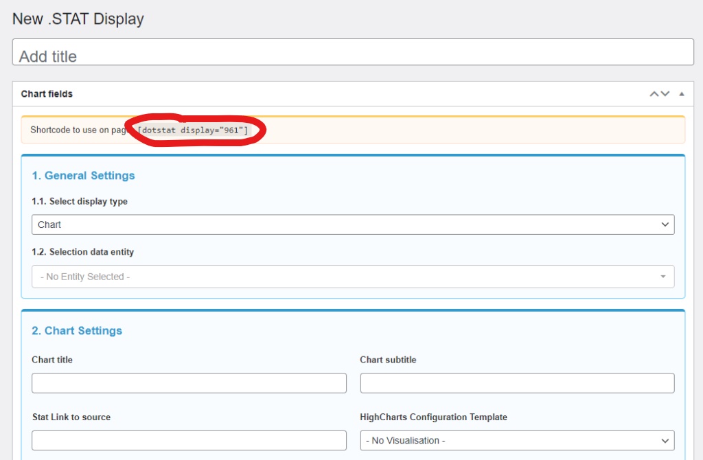
Insert shortcode into a page
Default editor
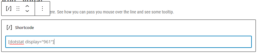
In the default editor, you can add a block of type “shortcode”
And paste the shortcode in the input field
Divi builder
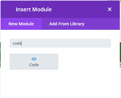
To insert a shortcode into a page with Divi Builder, we need to add a module to a page having selected first a layout (one row for instance).
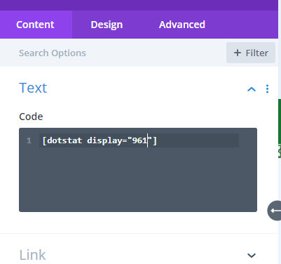
We can then add a code module and type in the shortcode in the input field:
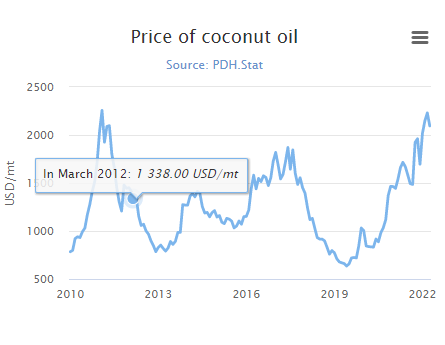
We can add some extra configuration to the .STAT Display in the “HighCharts Configuration (JSON Object)”. These follow the syntax of the Highcharts library. For instance we can add a label on the y-axis, disable the legend and customize the tooltip a little bit. Here is the full configuration:
{
  "yAxis": {
    "title": {
      "text": "USD/mt"
    }
  },
 "legend": {
    "enabled": false
  },
  "tooltip": {
    headerFormat: '',
    pointFormatter: function() { return "In " + Highcharts.dateFormat("%B %Y", new Date(this.date+"-01")) + ": <em>" + Highcharts.numberFormat(this.y) + " USD/mt</em>" },
    outside: true
  }
}
And…voilà!
The final result is available here. See how you can pass you mouse over the line and see some tooltip.
To go further…
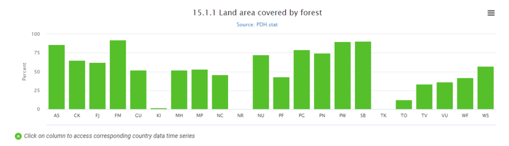
Here is a glimpse of some different type of charts we could create with this plugin and Highcharts features.
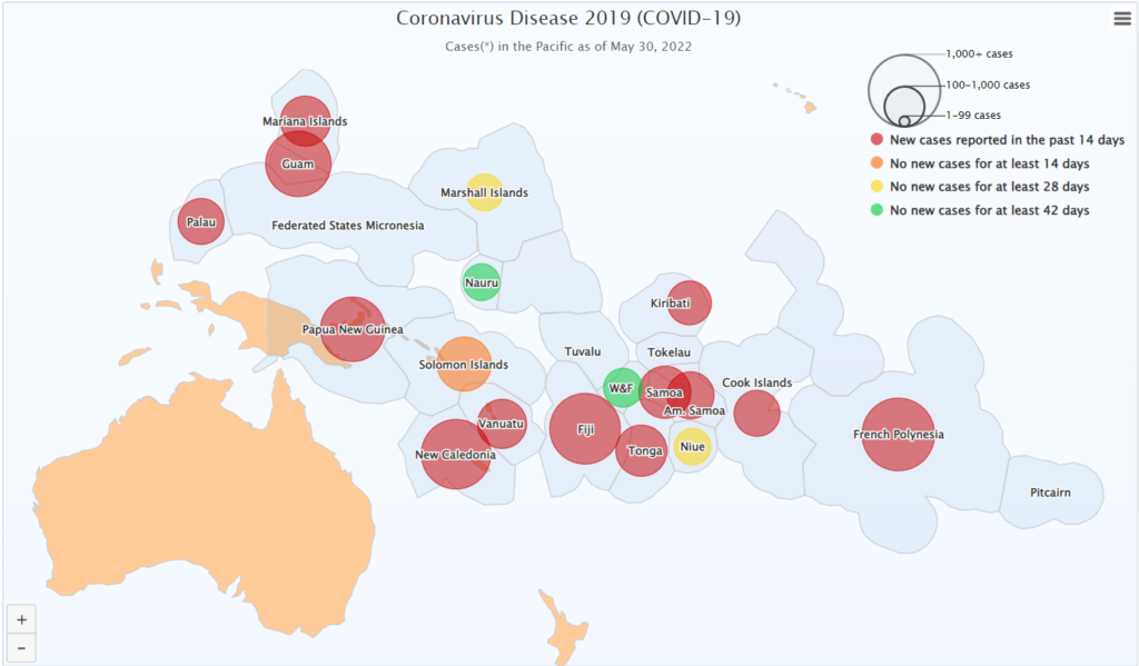
We can even create maps!! But I think this would need a specific tutorial.
Recent Comments